A Couple Common Questions
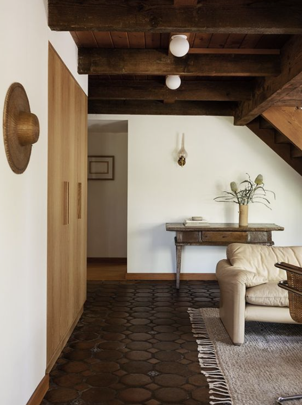
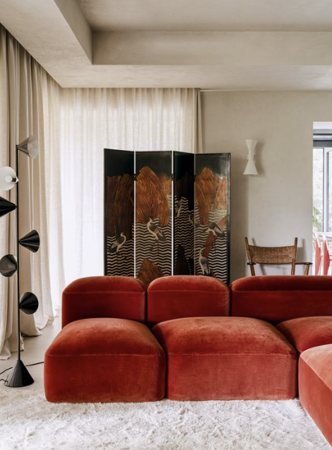
mixing woods
This is one that has been coming up a lot lately. "Can I mix wood tones" etc.
I think part of the reason why this is common right now is we just went through a phase of everything being light woods. Light floors, light furniture, light cabinets etc. Everything very uniform and nordic.
There's been a lot of this everywhere for the past couple years:
It looks great and is very sophisticated and uniform.
So can you mix woods? The short answer is yes. It's actually a very rich traditional look. I love it.
I'd add that you probably don't want to do more than 3 different colors of wood if you want things to look "tight."
When you start doing lots of different woods, you venture into woodsy cabin or farmhouse (not modern, the original rustic) territory. Nothing wrong with that, truly love them both, but I'm assuming most folks want a tighter look.
One of my favorite rules in design is "everything needs a sibling." What do I mean by this?
Everything needs an echo. Or almost everything. If you have a shape somewhere you should repeat it. If you have a color, you should repeat it.
This picture below is a great example - see how the nautical door panel is both an echo in round shapes and color to the wood side table? That's the exact kind of thing I mean. Door would look more out of place without that little table.
So if you want to mix woods, I would carry out each color choice across more than 1 piece. If you have chocolate wood dining table and different chairs, you probably want to get a chocolate wood something else and put it in the room.
When you do this, it takes the pressure off the table to be the focal point of the room and moves your eye around.
I'd also add you probably want to consider undertones of wood before mixing and generally stick to one color family.
So warmer redder and yellower woods will look good together. And cooler blue ,gray & green woods will look good together.
I have broken this rule, so don't worry too much.
low ceilings
A lot of folks have asked about what to do in a space with low ceilings.
"Hans, all the pictures you show are gorgeous spaces with soaring ceilings. I have a normal space space with low ceilings, what do I do"?
The first thing to think about is using lighter colors, at least in your main living areas. You probably want light colors on the floor, walls and ceiling, if you want to increase the feeling of openness.
If you have dark colors on your floor and you can't or don't want to change it, you could get a light rug.
*In small rooms with low ceilings, I don't think it's a bad idea to lean into the "cave" vibe. Nothing you do is going make them feel big, so why not envelop yourself in saturated darker colors. Could be a fun pop of personality. This is common in powder rooms.
Reflective surfaces are great for a space with low ceilings that you want to feel bigger. Like mirrors. I am writing this in a condo while I am on vacation. The condo was built in the 70's, and has 8' ceilings. By far the best feature is a large mirror wall in the dining room.
People say this is dated. Maybe it is, don't care. It looks great and I think would be a great feature to incorporate into new projects. Apparatus did this below in their studio, so it's good enough for me:
A lacquered or high gloss ceiling could be another way to go at this.
Another thing to think about is furniture. 4 things to think about that will help you:
Scale - is your furniture appropriately sized for the space? Do you have too much furniture? Does the size allow clear walkways (I shoot for 38" +) in and out of the space?
Arrangement - this is counterintuitive, but to increase the perception of space in a room with low ceilings, you want to pull furniture at least a little off the walls to give things some visual depth. If everything is crammed against walls it will feel smaller.
Height - if you keep your furniture low, it will make your ceiling feel higher. Also, if you can align horizontal surfaces, like the seat height and coffee table tops, it looks really great. This is a classic design trick.
Obstructiveness - There's probably a better word for this, but if you were going to pick a chair for a small space with low ceilings, you might want to pick something that light passes through as opposed to something that blocks light. See what I mean below:
Light passes right through that sling chair, it's very airy visually speaking. Bottom chair not so much. It looks comfy but it's a wall visually. If you need more light and more openness, think about this when it comes to furniture. Also furniture on legs helps.


