Visual Interest
function + harmony + visual interest
Yesterday I was consulting a gentlemen on the renovation of his newly acquired NYC condo. I said something during the call that I've repeated a bunch of times in different ways, but I think it's important to reiterate.
Good design, as I see it, is really combining three different things in a space. If you can do all three (most can't), you are that much more likely to hit a home run on your projects: function, harmony & visual interest.
function
Things need to work. You need to be able to easily get from A and B. You need places to store your stuff, wash your dishes, prep your meals, and comfortably use the restroom.
The space should never make you feel cramped. It should also never make you feel cold and isolated.
Spacious walkways should be honored.
There should be lots of outlets to plug things in, especially in kitchens, offices and areas where you might have a lamp or computer.
There should be dimmers on your light switches.
This is not the sexy stuff that gets you the points as a designer, but it's crucial for the end user.
I am a huge aesthetics guy, so am writing this more for myself than for you. Things need to function in addition to looking good.
harmony
Visually, things to need work together, in harmony. You can't do everything. You need to pick a look and execute it well. You can't do unlimited colors and decorative objects and light fixtures...although it's certainly fun to dream.
Harmony is really defining a theme and carrying it out. It's a deliberate restriction of choices in favor of a unifying look over an individual moment.
As you walk through a space, a narrative should unfold that tells a cohesive and intentional story.
I think a lot of designers understand harmony well. That's why there is such an abundance of neutral interiors today. White and wood and a little black do indeed work together.
BUT you also need...
visual intester
The elusive key to all great design and hospitality. Novelty might be another way to say this.
What this means is you should see stuff in this space that you don't see every day. Little moments of uniqueness.
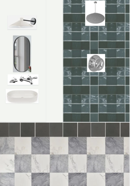
(this is a simple collage of a bath I'm really excited about. Large project in Brooklyn, more soon on this)
The light that's a slightly different shape.
The color that you normally see as an accent enveloping a whole room. The door handle with some detailing.
A moment of textured wallpaper covering a dining room.
An outdoor space with hanging pendants instead of string lights.
This is what gives a space personality and makes it, as my mentors from afar Zig Ziglar and Seth Godin say, "a meaningful specific."
Again, you don't go overboard with this. One or two interesting things in each room is plenty. Interesting things tend to look best set against relatively plain things.
So, if I had a really interesting rug, I'd probably dial it back on the sofa.
facebook marketplace
I have done this before as a newsletter segment but I'll do it again. You could could furnish a whole space from facebook marketplace if you were willing to wait and drive around a lot.
There is so much cool stuff on there.
I know that a lot of the people who read this are aspiring designers on a budget and this could be a great way to tackle your space without a lot of money.
Also, great way to find one-of-a kind things. Here's some things that are on Facebook Marketplace in my market today:


