Walking Through A Theme
Topanga house
Got to stay at a really fun contemporary house in Topanga Canyon for the 2 days, about to head back home.
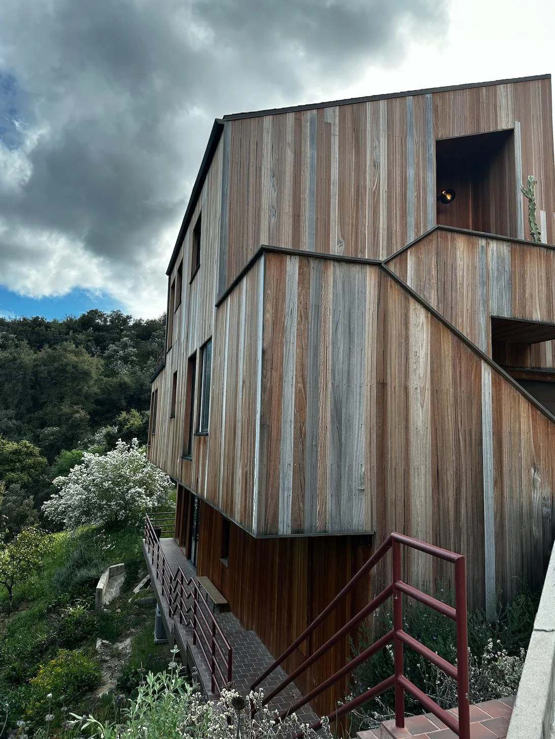
This is a simple but striking home. Apparently the woman who owns it designed and built it herself.
*Side note: Probably the best way to get really really good at design to is build a house. That's what I did. You don't have to be a contractor to build a house - you hire one & hire an architect. You tell both of them what to do. It will completely take over your life for a year or more, but it will probably be worth it.
This home has a calming modern cabin aesthetic that's that is perfectly situated to its hippy hillside surroundings.
Nothing here is complex, but they did a lot of things right, and it makes it feel like a hyper intentional cohesive space. It's luxurious, in an approachable way.
The home makes use of a lot of inexpensive things, repeated across the entire property, to give us a strong sense of place and elevated themed feeling.
Here are some things that I noticed that they use to create a theme:
First, wood. And lots of it. The entire exterior is clad in cedar.
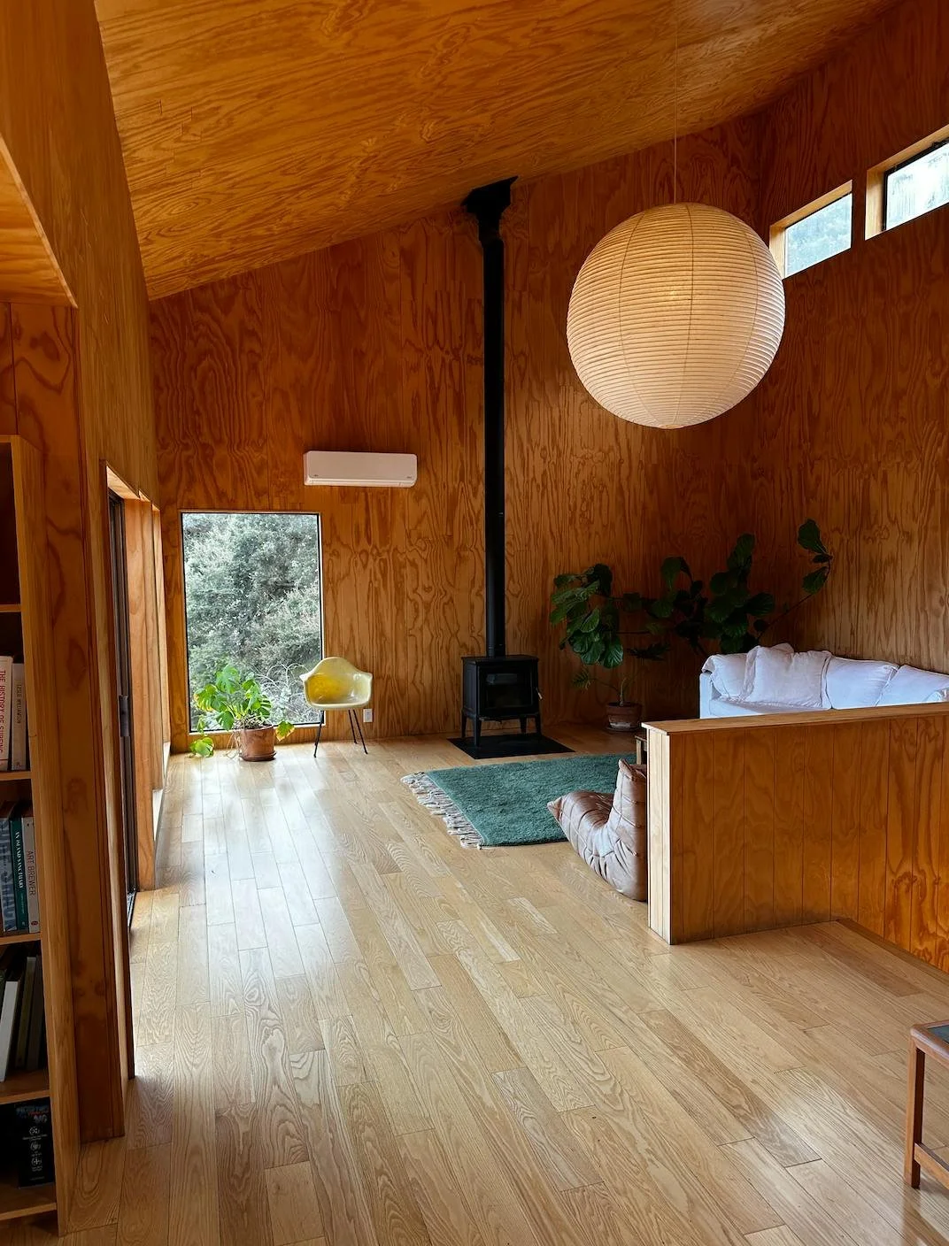
This and the windows would be the most expensive parts of the home. They echoed that wood by using wood paneling on the walls ceilings of the main living space.
It feels wonderful and incredibly warm.
Door knobs.
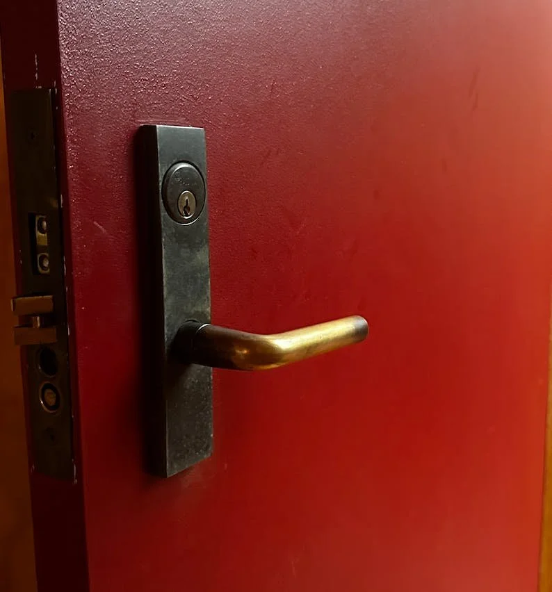
All door knobs are small simple brass door knobs. The door hardware on the front door is brass as well.
Brass does a ton to warm up a space. Repeated everywhere and you notice it. Simple touch, highly effective.
Light switches.
These are super cool. I've never seen these.
The fact that you don't see them every day, the fact that you twist instead of flip, and the fact that they are in every single room makes them a strong a noticeable part of the theme of the entire space. It's great.
The color red. The front door is this beautiful red color.
They took that same color and painted railings on the walkways and patio areas outside. They also red tile outside.
The fact that all of this is in harmony with each other leads to a very tight color scheme and theme throughout. Another great move.
Light fixtures. They used simple old school porcelain flushmount fixtures.
They repeated these instead of recessed cans. Black in the kitchen. White in the hallways, and sconce style in the bedrooms.
Again, a dedicated theme, present in every room. Inexpensive and cohesive.
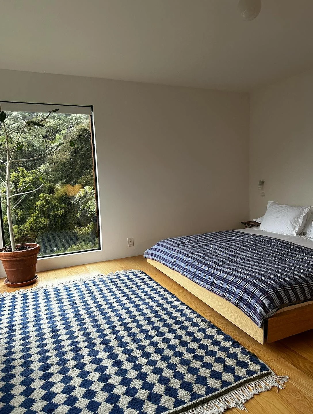
The bedrooms. Very very simple modern minimalism. In each of these spaces the used color rugs and textiles to excite things and also placed a couple older textured items.
Now instead of feeling cold and overly ikea, you feel like you are at your cool architect aunt's vacation home. More cultured.
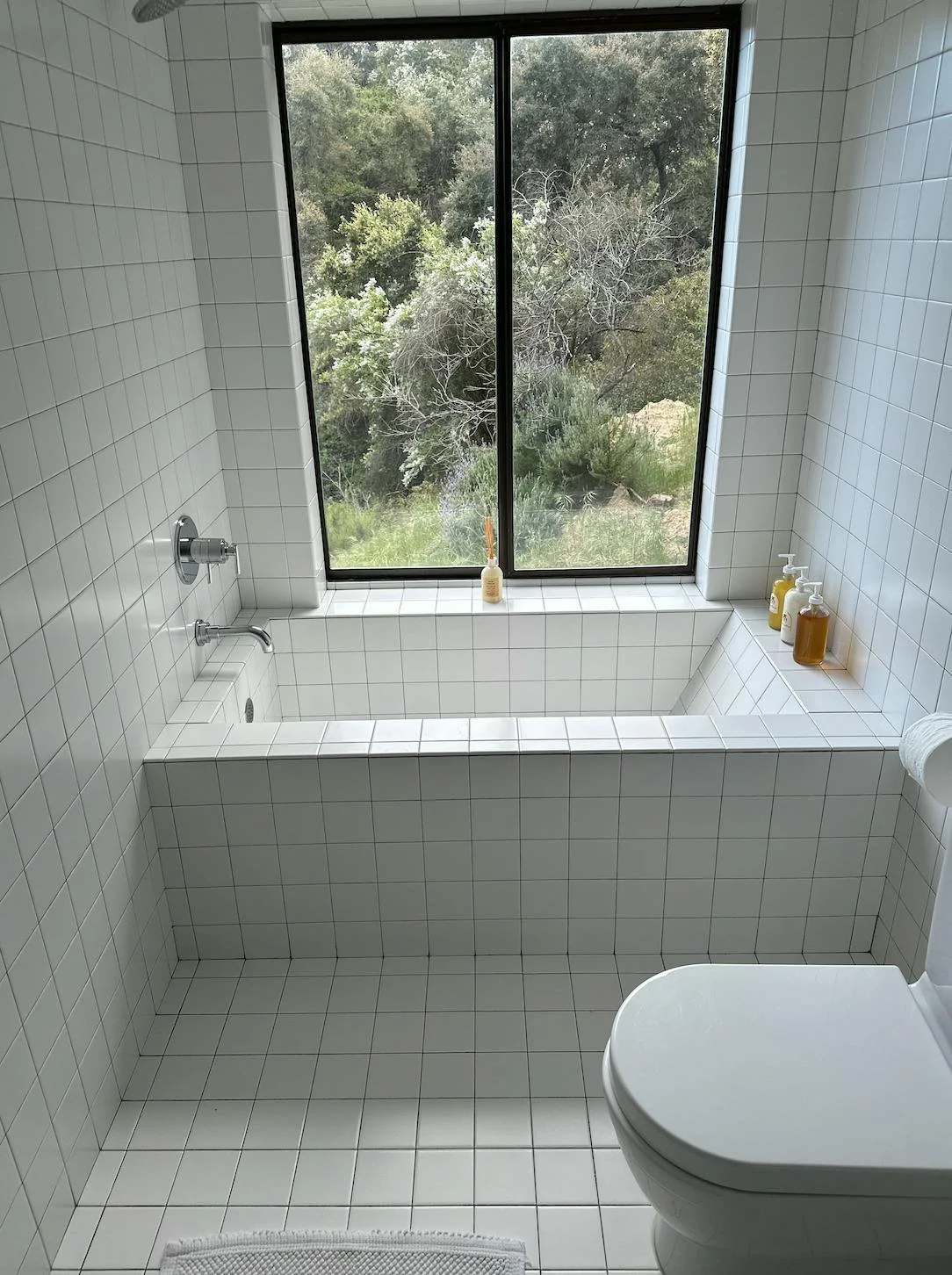
The bathrooms. You might like these, you might not. Super tight theme. Inexpensive white tile on floors and walls. Tile sinks and tub. Chrome hardware and medicine cabinet mirrors. It looks cool, it's very simple and effective.
Strong theme theme throughout this entire place. They've created something that has a nice ratio of modern and cool to warm and weathered. I learned a lot and hope you did too.
Happy Easter & wishing you a beautiful spring!

