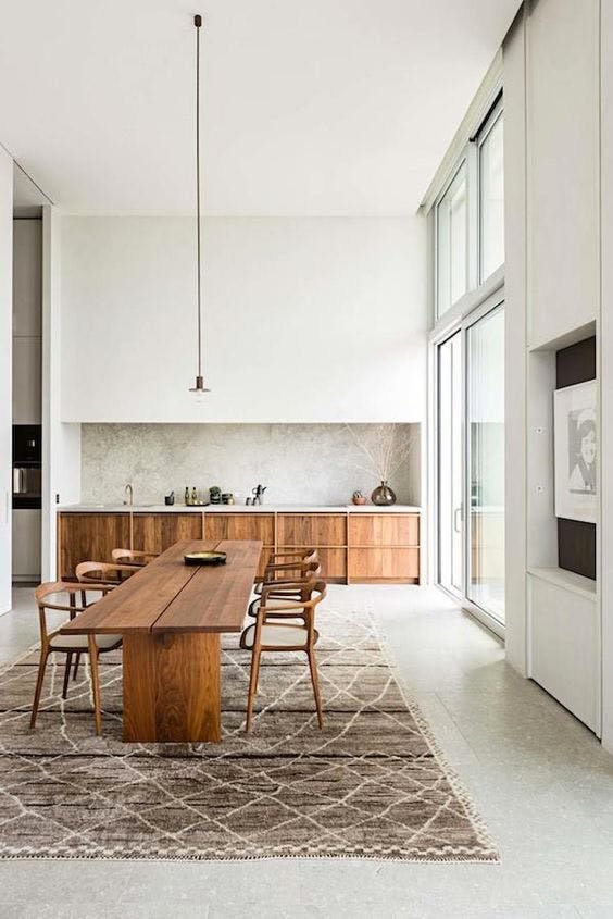
Enclosure: pockets of refuge
I've tweeted and created video about this over the last couple days, but I think it's a critical concept so you're going to hear more about it today.
What all of us want is Enclosure.
It's been hardcoded since our cave dwelling days, but even if you never lived in a cave, you were still once in womb.
I have two young kids and this is very obvious with fort building, hiding in closets, being under covers etc. Safety and refuge are an essential human need.
This is especially relevant in our day and age of open floor plans. When you have a small house with small rooms or an apartment, it's less applicable.
But increasingly, homes are large and open, at least the stuff I look at. And we need to create a feeling of refuge in those homes.
For the record - I LOVE open floor plans, high/vaulted ceilings, big windows etc. I grew up in a small cramped house and the feeling of space is one I don't take for granted.
BUT within that open space, you need to create little pockets of refuge.
Look at this picture - it's a perfect illustration.
Huge soaring space. Gives you feelings of openness, grandeur, possibility.
But do you want to just sit in the middle of all that public openess with no shelter?
No. Not such a great feeling. That's why they've got those trees.
They created a little courtyard within this cavernous space, so that folks can sit enclosed under the canopy of the trees, tucked away in a refuge from the hustle and bustle.
Umbrellas at resorts/restaurants are not just sun protection. They are creating lots of mini rooms with mini ceilings within a vast open space.
This is what you want to do too. Create little pockets of enclosure throughout your space. Visual boundaries. And it's pretty easy.
The easiest way is to use existing walls. There's a reason why we generally put furniture in corners and against walls and not in the middle of the room.
It's nice to be enclosed on 1 or 2 planes, and that's all you need to do. Even just a side table adds a nice sense of enclosure to a chair.
A pendant over a dining room table gives things a sense of a "ceiling." Where the light falls is where you feel enclosed.
String lights over a patio or deck do the same thing. Feels like a ceiling.
You can easily do this with a couch by putting a piece of furniture on one side and a lamp or plant on the other.
Hospitality is way ahead of the game here. A "lounge" basically means a room with a strong sense of enclosure.
Why is hospitality ahead of the game? Because there's an actual financial incentive to getting this right.
Easiest cheat code for any designer is to just do what hospitality does inside a home.
So look for areas throughout your space that are sparse or barren or naked looking, and enclose them. Create the illusion of a boundary. Even just a rug helps with this.
If you do this, people will walk through your space and love it.
They won't know why.
If they say something like "wow this is so nice, I wish my space was like this," just tell them to subscribe to Differentiated Design ;-)


