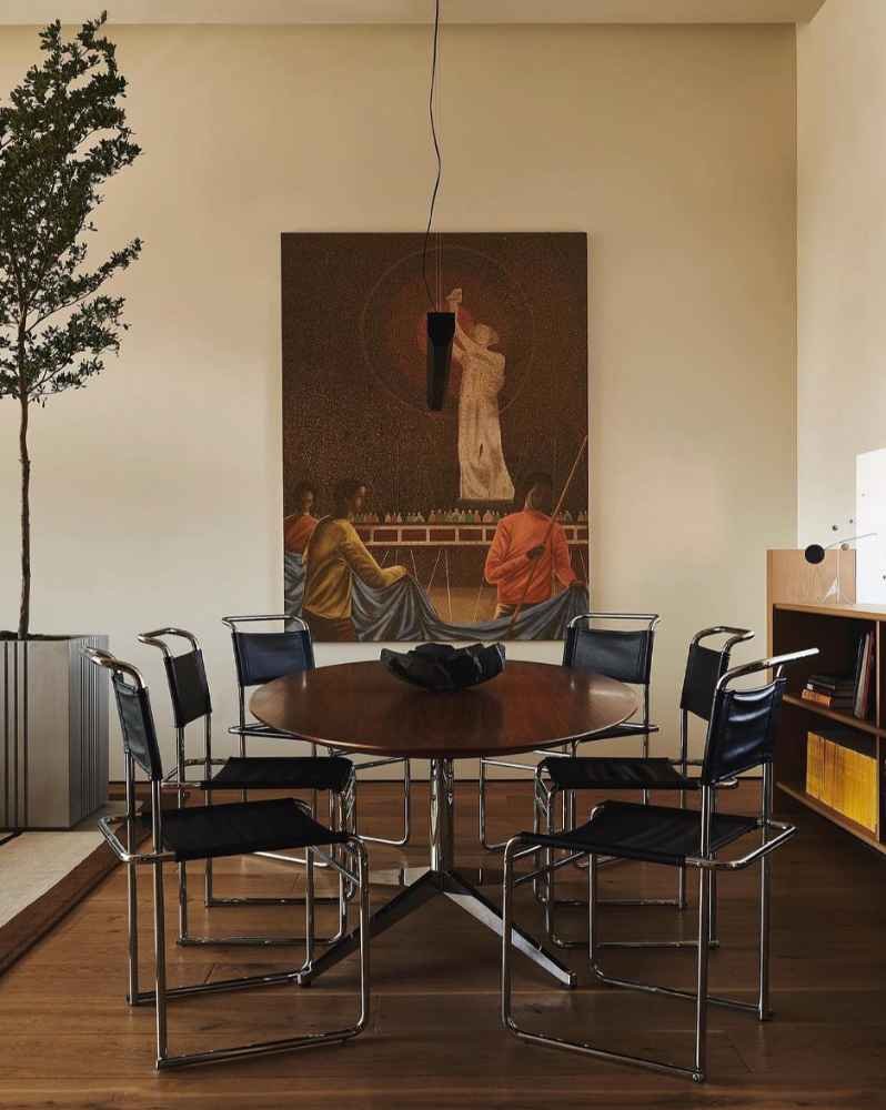
The brave choice
Good designers take chances and try to do the most interesting thing. Something you don't see every day. Often not the safest mainstream choice.
This looks like choosing something 80% of the population would shy away from picking, giving that it's a little "edgy" or "bold" or "weird".
That could be something like a unusual but beautiful railing
Some loud post modern tile in a bathroom
Cool door knobs
Lights that are alive
A drop dead gorgeous wall color that is not white or grey
At the time you are picking this, you are thinking to yourself "Am I really doing this?" "Is this too much" "Will I destroy my relationship with my client"
One of the ways to know if you are doing "too much" is the....
1 normal & 1 interesting framework
If there is one single rule that probably covers the most ground in design, I think it's this one.
Pair 1 normal thing with 1 interesting thing. 1 Safe and Comfortable thing with 1 Bold & Exciting thing.
The video that kicked things into high gear in my Instagram is this exact thing.
Normal dining table? Get Interesting chairs
Grey sofa? Interesting coffee table
Balance out your eccentricity. Balance out your brave choices.
To tie this all back together, IF you
A) Make the Brave Choice 80% of people wouldn't make
and
B) Balance it appropriately
the paradox is of course that 80% of people will LOVE it because it looks so much more interesting than the average baseline
Be Brave & Be Balanced!
few things I've seen
Studio Mellone
If you are into the quiet luxury trend, this guy to me is a great embodiment of it. Lots of subdued personality, somewhere in between minimalist and 80s post modern. Pretty nice.
Submarine Pendant by Streicher Goods
Handmade by one dude in Brooklyn. So fun


